
What is a Style Guide?
A website style guide outlines a comprehensive set of standards for a company for its brand identity and how those identities are expressed on its website. Within those standards are a set of rules or guidelines for how its visual elements should be used throughout its site. These rules or guidelines are typically used as references for anyone who works on the website.
Why do Companies use Style Guides?
The main purpose of a style guide is to maintain a consistent brand identity or brand design pattern across the company site. Maintaining that consistent design pattern or identity leaves an overall professional and structured impression on the user.
Many companies will have multiple people working on the website so the style guide gives everyone a set of standards of reference to communicate a consistent vision and approach. Style guides make it clear for all contributors and collaborators to be on the same page. Contributors will not have to worry about making their own decisions for design and thus will save the company time and money.
What Should a Website Style Guide Include?
What exactly is included in a website style guide depends on the needs of the company and what industry it is in. For a web design style guide, components often include a combination:
A guide for the logo
Color schemes and color palette
Images and icons
Typography (typeface choices and font sizing)
Components like buttons and forms
There are many other components that can be included such as spacing, marketing guides, mission/values, target audience identifiers, template design, etc. Again the needs are based on the company itself.
Style Guide for AlexVong.dev
I created a style guide for my personal website for the purposes aforementioned above. Although this is just my own personal website and there will not be any other contributors, I felt it was important to create a brand identity for alexvong.dev.
Now please keep in mind that this is my first time creating a style guide and I have zero experience in making one. The way I decided to tackle it was based on my own needs for my personal site.
#Logo
It is important to define rules for using a logo and all its variations. These could include your logo’s grid, font, colors, correct spacing and placement, appearance on different backgrounds, and more. It is also imperative to have a design for light and dark modes.
I did not use an actual for my personal site. I debated on creating a unique design with my initials or an icon/image that I felt represented who I was but at the end of the day, I felt it was unnecessary.
Logos in itself are identifiers for companies. Often when you see a famous logo such as Spotify, Facebook, or Apple, you can instantly identify the company even though its name isn’t featured on the logo. I did not implement a logo because A) I am neither famous enough to be easily identified with a logo and B) my main goal is to get the user to know who this website belongs to so opting to replace a logo with my name would do the job.

I technically had a total of 4 “logos” for my site. At the helms is my full name in a large font and when you scale the site to mobile, my name turned into my initials. At the stern of my site located in the footer is the same concept as above, however, they are in smaller font sizes.
#Icons
Icons are another important stylistic choice for a website that requires a set of rules for how they are used. This includes whether a company wants to hire a designer to design their own custom icons or use pre-made icons. The way it is designed, its color schemes and the use of spacing are other decisions that need to be considered.
Like logos, I did not create nor utilize many icons. The only icons I featured were those of my social media handles and I elected to use pre-made ones from FontAwesome. I do feel it is important to include them in my style guide because I use them in a reusable component throughout my website and using the same icons is key to maintaining a consistent design identity.

#Color-Palettes
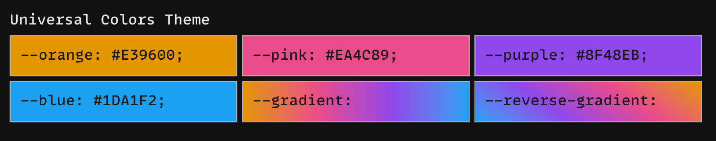
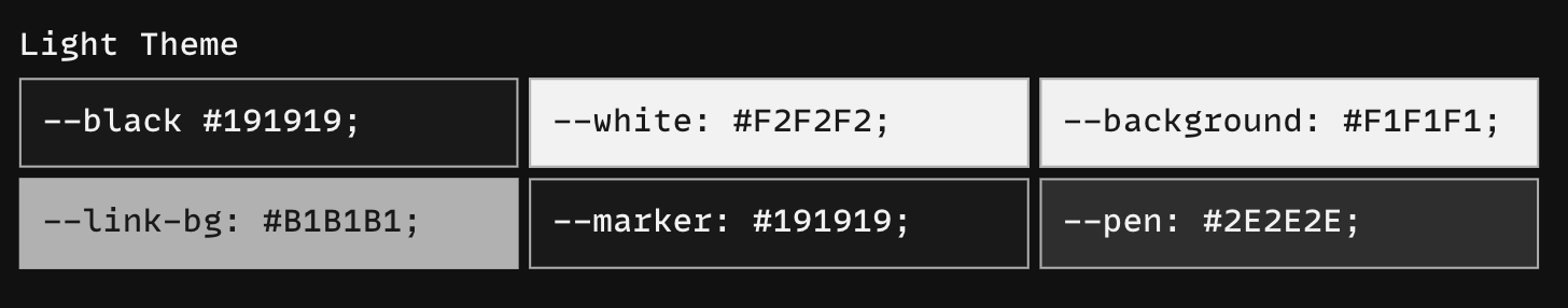
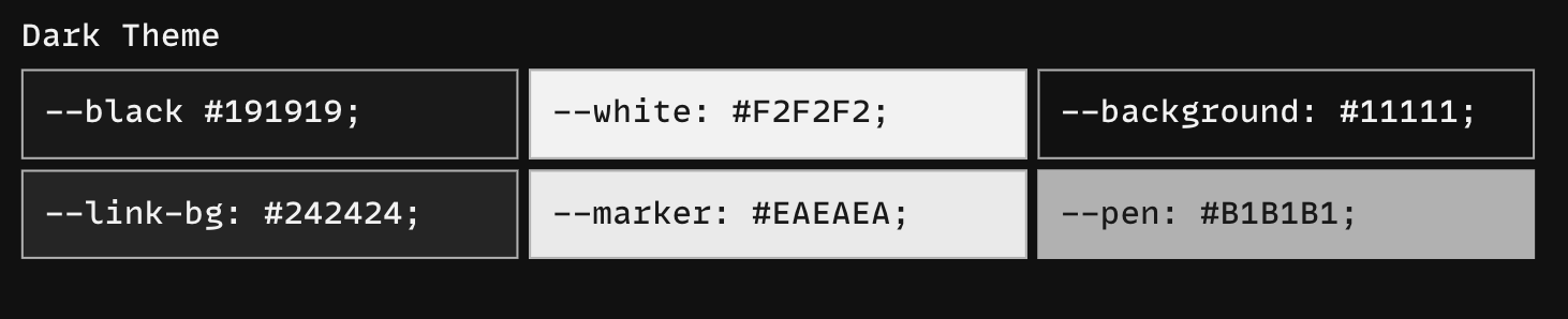
Color plays a vital part in how your website and brand are perceived and remembered. My site features 3 sets of color palettes, one for light mode, one for dark mode, and one that will be used for both.
The color palettes are definitely still a work in progress as of writing this article. I have many similar colors so I will most likely narrow down my palette to just a few essential colors followed by a few secondary, tertiary, and neutral colors ¯\_(ツ)_/¯
A universal palette
A light mode palette
A dark mode palette
#Fonts/Typefaces
Just like color, typography is an essential part of web design and as such should be included in a style guide. To ensure yours is appealing and consistent throughout your website, you’ll need to create a typography hierarchy in your style guide.
Here are the typefaces I chose for my headings and body copies:
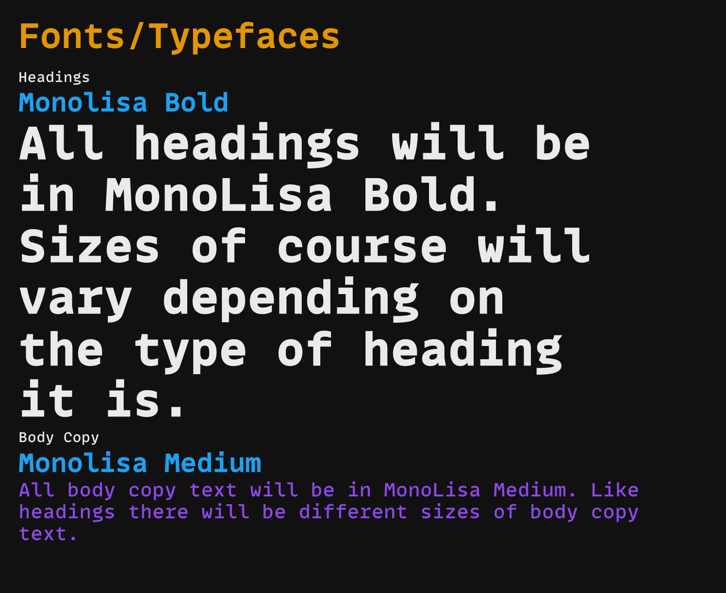
As well as the font sizes of those headings and body copies throughout my site:
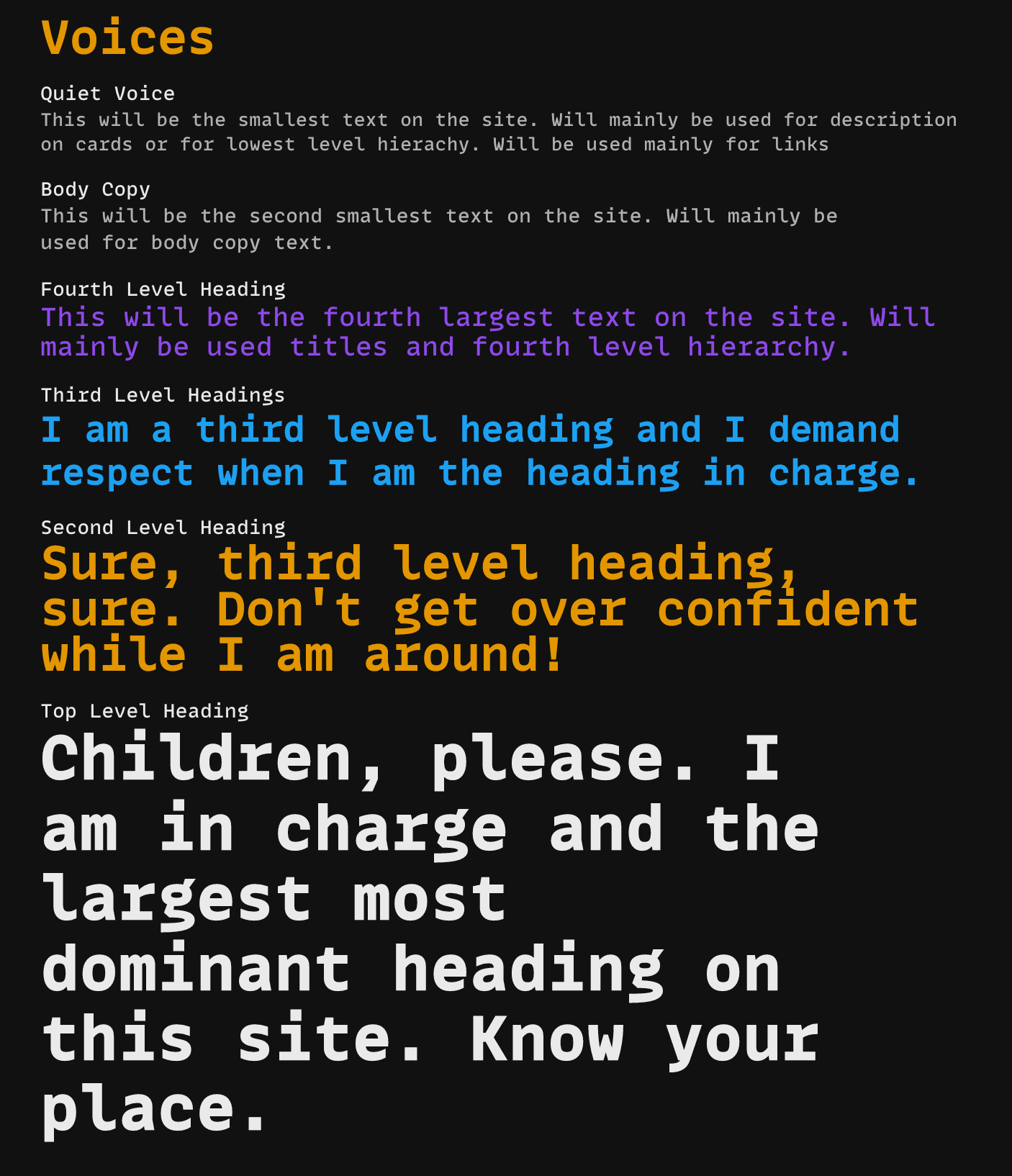
Normally you’d also include the specific sizes for each heading in your style guide as well but I am still sort of playing around with the font sizes for a more fluid and scalable design. It is important to make sure the text scale from mobile to desktop and vice-versa.
#Buttons
Having a set of rules for buttons is also important. It is important to have a consistent design for them and not have several buttons with completely different design patterns to them.

Keeping Your Style Guide Up To Date
Lastly, design trends come and go fairly quickly and are constantly evolving so you’ll need to refresh your brand language and identity over time. If a company wishes to continue to grow, its style guide cannot remain static but rather implement change regularly over time.