One of the coolest things about web design, and websites in general, are that those designs are all unique to the individual business. From color palettes to typography to layout and spacing, there are infinite ways to design a website and because of that, it is difficult to find two websites that share the same design.
While the design of the website is often unique to the company, the content structure is almost universally shared amongst literally every company and website you see nowadays. These websites are designed and built on a set of reusable components and structures but decorated with their own fancy designs and placement on the site which allows those websites to look so different from others.
Websites you see in the wild share these reusable components:
Navigation bar
Landing page
Call to Actions
Items in a Grid Layout
Footer
Although no exactly the same, after writing this intro I immediately thought about this awesome video.
#Navigation-Bar
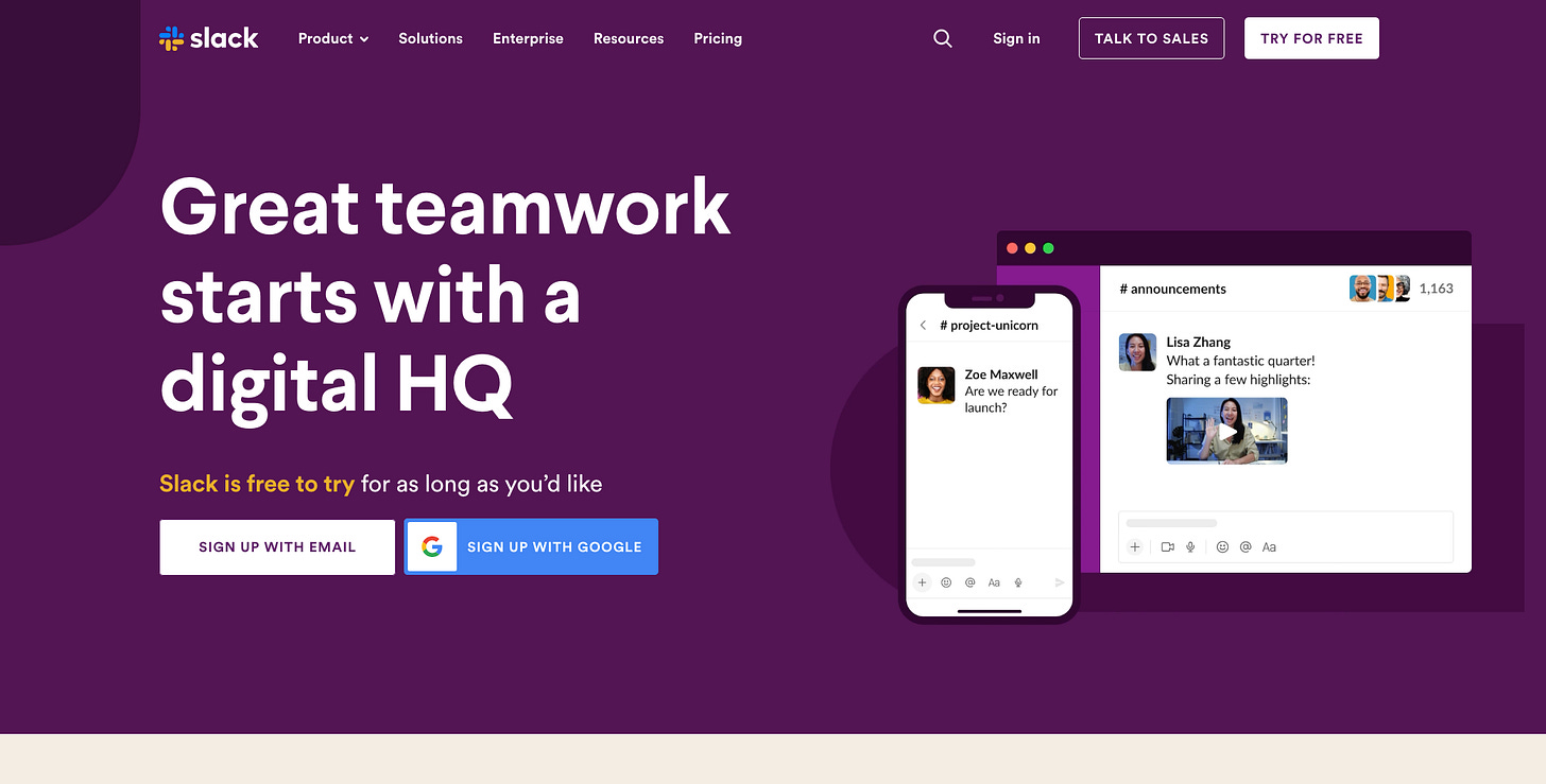
All sites feature some sort of navigation bar at the helms. That is pretty straightforward and makes sense as the user needs to be able to navigate across the site and find what they are looking for. The structure of the navigation bar and its content may vary per website but most times there will be a logo on the left followed by some spacing and a list of links the user can click. Here are a few examples featuring the nav bars from the Apple Store and Slack.
#Landing-Page
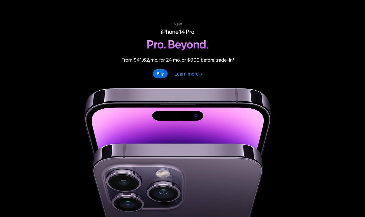
Under that navigation bar will be a landing page, which will often take up a good chunk of the screen. The landing page has a large heading, some text under it, a button or input form of some sort, and some large image or design.
#Call-To-Action
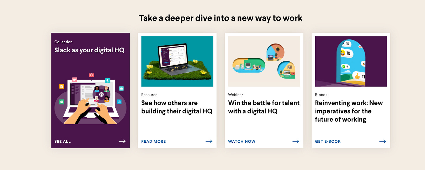
Throughout the site, there is usually a bunch of call-to-action sections. Frequently these CTAs will be dressed up differently with their own bells and whistles, but don’t be fooled, they are all the same thing. Remember, if there is a fancy button or link that prompts you to do something, then it is a CTA, no matter what it looks like.
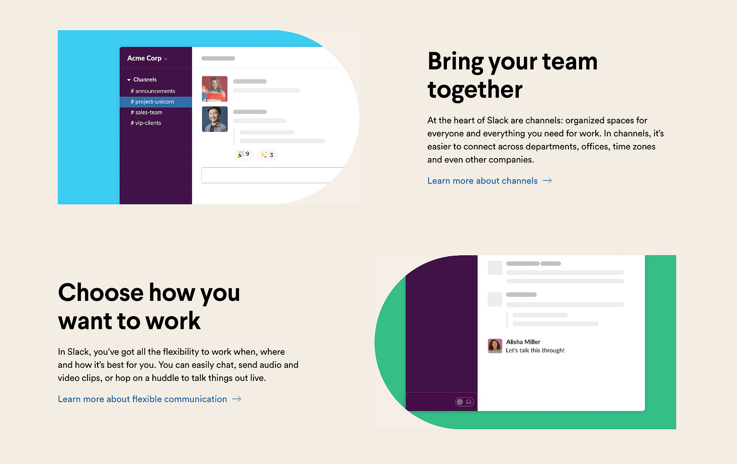
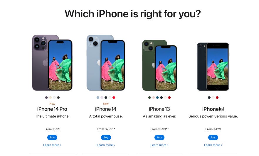
Both Slack and the Apple store are prime examples of utilizing a bunch of variations of CTAs.
#Article-Grid
Grid of articles or images are also common on most websites these days and fall under the design template umbrella.
#Footer
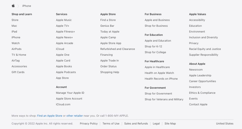
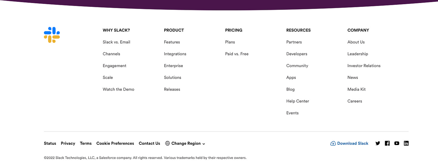
And last but certainly not least, almost all websites, or at least they all should include a footer. Footers usually contain the company logo followed by a list of links separated by categories: social media, legal stuff, contact, about, pricing, etc.
#Other-Stuff
Now depending on the company, there may be other additional sections featured on their company website. This may include a sign-up form, a drop-down for more information and FAQs, a carousel of images, videos, etc.
But regardless of the company, the components aforementioned above are the basis and blueprint of almost every website you see in this day and age.


